

GROUPS ADMIN HOME
Admin Home is a centralized surface in Facebook Groups that brings every moderation tool, settings and to-do into one dedicated place so admins can easily manage their group, grow it and sustain it. I worked on the new web/desktop architecture, building the experience on FB5 (new redesign language), while collaborating with my partner designer on the overall principles, framework and layout for mobile.
Ex. Dianna, who runs a national running group, can quickly review spam alerts, approve member requests and check on how her posts are doing, all from one view, then hop back into the main Group feed to engage with her members.
- ROLE
- Product Designer
- TEAM
- 1 Product Manager
2 Product Designers (including me)
7 Engineers
1 Content Designer
1 UX Researcher
1 Data ScientistCollaborated with 4 other Groups teams & 10+ XFN teams - TIMELINE
- 2018–2022
IMPACT
6.5M weekly active admins
EXCEEDED ADOPTION GOAL BY 18%.
+7.25% admin time spent
DEEPER ENGAGEMENT WITH ADMIN TOOLS ACROSS MANAGEMENT SURFACES.
+2.74% thriving admins*
LIFT IN ADMINS WHO RUN HEALTHY, ENGAGING GROUPS (POST LAUNCH IN H2 2021)
* Thriving Leaders: admin efficiency (how fast admins completed group management tasks) and time spent (engagement with their group and members).
RESULTS
86% of participants in a 12-day diary study rated Admin Home better than the previous experience; 93% also said they liked (Agree – Strongly Agree) the new management experience.
Admins approved content faster, and admin-approved posts received 1.1% more views.
CONTEXT
Facebook Groups was supporting 11.7M daily active admins running 9.75M well-governed groups. Over the years, different teams across the organization had built their own admin tools, settings and features — with no single team owning the overall admin experience. The result was a fragmented landscape and unintuitive experience for group admins.
Bring group management into one cohesive Admin Home, so admins can find the tools they need, act with confidence and support their communities as they grow.
PEOPLE
PROBLEM
Managing a Facebook Group meant navigating a maze. Admins couldn’t find tools that already existed, so adoption stayed low.
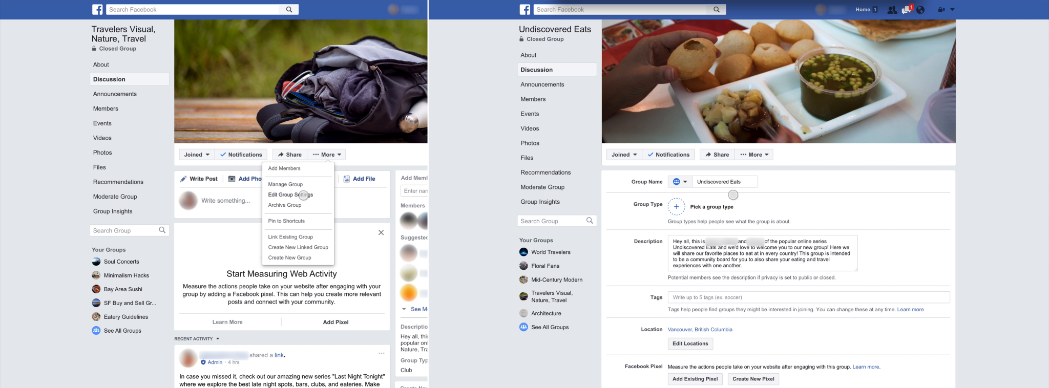
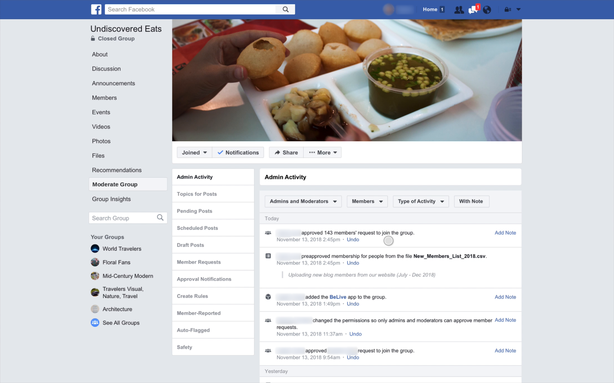
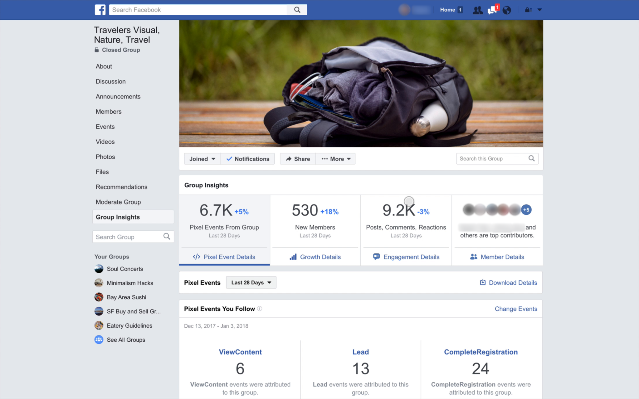
Three key admin spaces (Group Settings, Moderate Group and Insights) lived on separate surfaces, with no shared hierarchy or clear way to rank new features. Years of design and technical debt led to inconsistent interactions, made tools hard to find, and made it difficult for other teams to add features where admins would expect them.
Admins lose time switching between disconnected surfaces.
UXR INSIGHT
In the diary study, admins valued seeing every pending item in one place, which cut down on switching between surfaces.
Useful tools were going undiscovered.
UXR INSIGHT
Grouping tools together helped admins discover, or rediscover, features they hadn’t seen before, like Insights and Group Quality.
Power admins depend on speed.
UXR INSIGHT
Established admins valued an at-a-glance activity recap, and research cautioned against oversimplifying the workflows they rely on.
BUSINESS
OPPORTUNITY
How might we give admins — from first-time creators to power admins — a cohesive, intuitive experience to manage their entire community?
Admin Home can bridge that gap by:
Making tools discoverable. Research showed admins weren’t using powerful features simply because they couldn’t find them. A unified surface with contextual education could drive adoption without changing the tools themselves.
Clear separation of admin and member spaces. Admins need to manage their groups and participate in them. Giving each activity a distinct space makes it easier to focus while keeping the member experience familiar.
Compounding with every new tool. A modular desktop architecture gave partner teams a clear place to add new tools. Shared navigation and a consistent hierarchy could support more capabilities without scattering them across new pages or requiring another redesign.
DESIGN
PRINCIPLES
- Grow with admins. Admin Home serves every admin and adapts as their needs change. Someone running a multi-network community should find it as useful as a brand-new admin, with the right tools recommended at each stage of their community.
- Be predictable, like a dashboard. Admins should know what to expect each time they come back, without things moving around. Every element either takes them somewhere useful or shows status at a glance, and new tools fit into clear homes without a redesign.
- Less time here means success. Optimize for speed to action: get in, act, and get back to the community.
RESEARCH
Organizing tools around how admins work
Bringing Moderate Group, Group Settings and Insights into one place solved fragmentation, but created a new hierarchy problem: what should admins see immediately, and what could sit deeper? I worked alongside my fellow product designer and content designer to define the categories and create a framework for prioritizing, ranking, and placing new admin tools.
| Tools | |
|---|---|
| Purpose | Take action |
| Priority | Frequent tasks need clear visibility and quick access |
| Examples | Moderation queues, member requests, Admin Assist |
| Settings | |
|---|---|
| Purpose | Configure the group |
| Priority | Less frequent configuration stays accessible in a predictable location |
| Examples | Privacy, posting permissions, group description |
| Features | |
|---|---|
| Purpose | Enrich the member experience with optional, customizable capabilities |
| Priority | Group related capabilities so admins can discover and manage them when needed |
| Examples | Events, chat, topics, badges |
On desktop, this gave the left-hand management panel a clear structure. Frequent actions had prominent entry points, while settings remained easy to find without competing equally for attention. Features that supported community activities had recognizable homes within the same system.
RESULTS
This new structure and definitions (tools, settings, features) also meant internal and external teams now had a shared understanding of where to situate their new proposals.
Internally, the Groups team approved proposals from other teams 30% faster on average. The new architecture and clearer guidelines enabled faster reviews and easier collaboration.
SOLUTION
Separate the admin from member view
I proposed a new layout and navigation model for Groups that separated the member-facing view from the admin management experience:
Additionally, a toggle allows admins to easily collapse the panel to focus on content creation and engagement, creating a distinct admin-member view experience.


DESIGN CONSIDERATION
The Moderate Group tab, Group Settings page and Insights page became sections of one surface with a clear hierarchy.

DESIGN CONSIDERATION
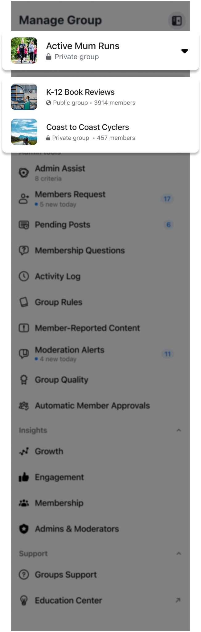
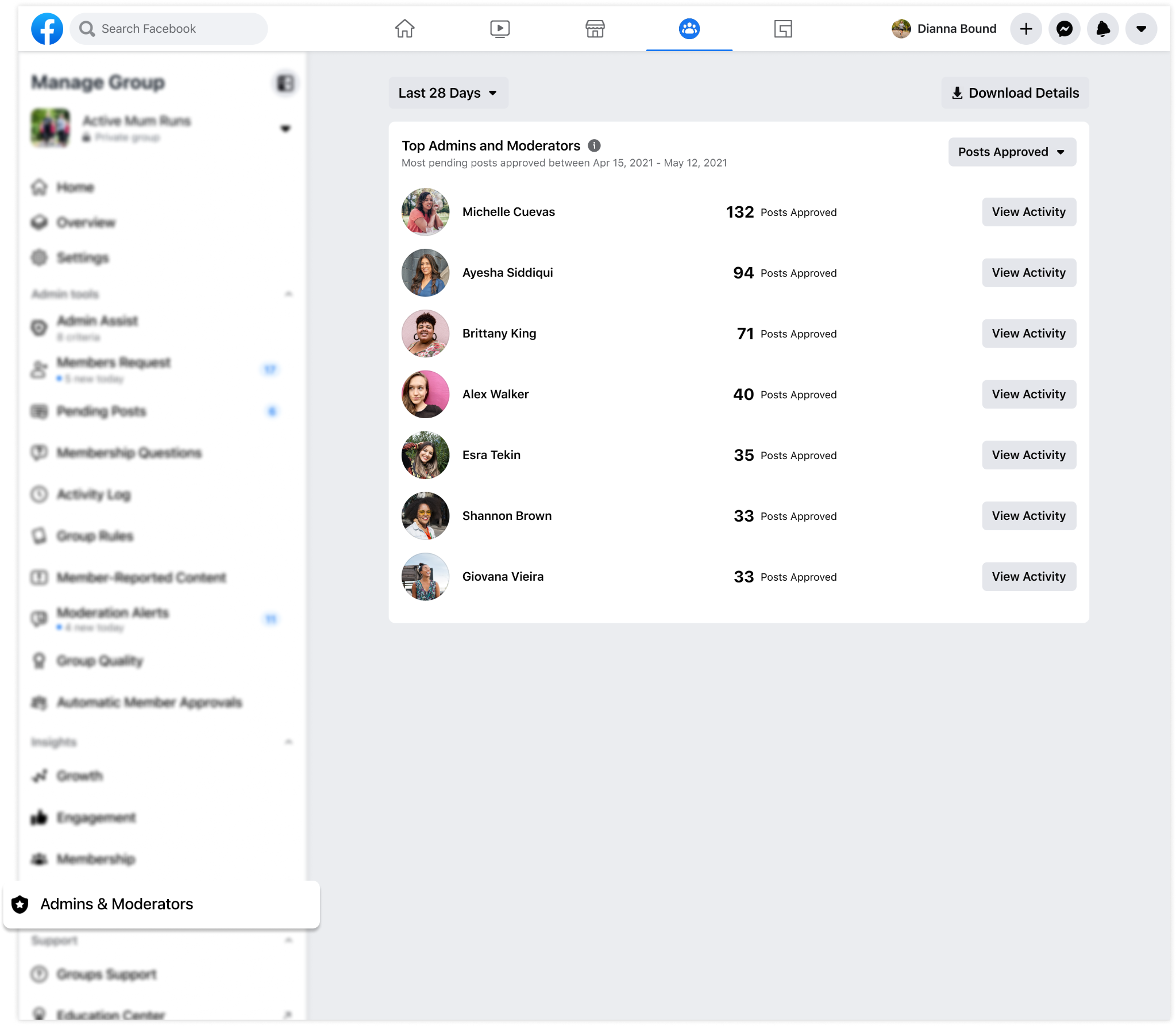
Admins can collapse individual sections to keep the tools they use most in view.

DESIGN CONSIDERATION
Badges surface pending work in the navigation so admins can see which tools need attention.
DESIGN CONSIDERATION
The group switcher gives admins who manage multiple groups a way to move between them from the same panel.
RESULT
91% of study participants valued having pending work, tools and community health in one place. Bringing these together helped them discover features and move through pending work more quickly.
Core surfaces
Overview
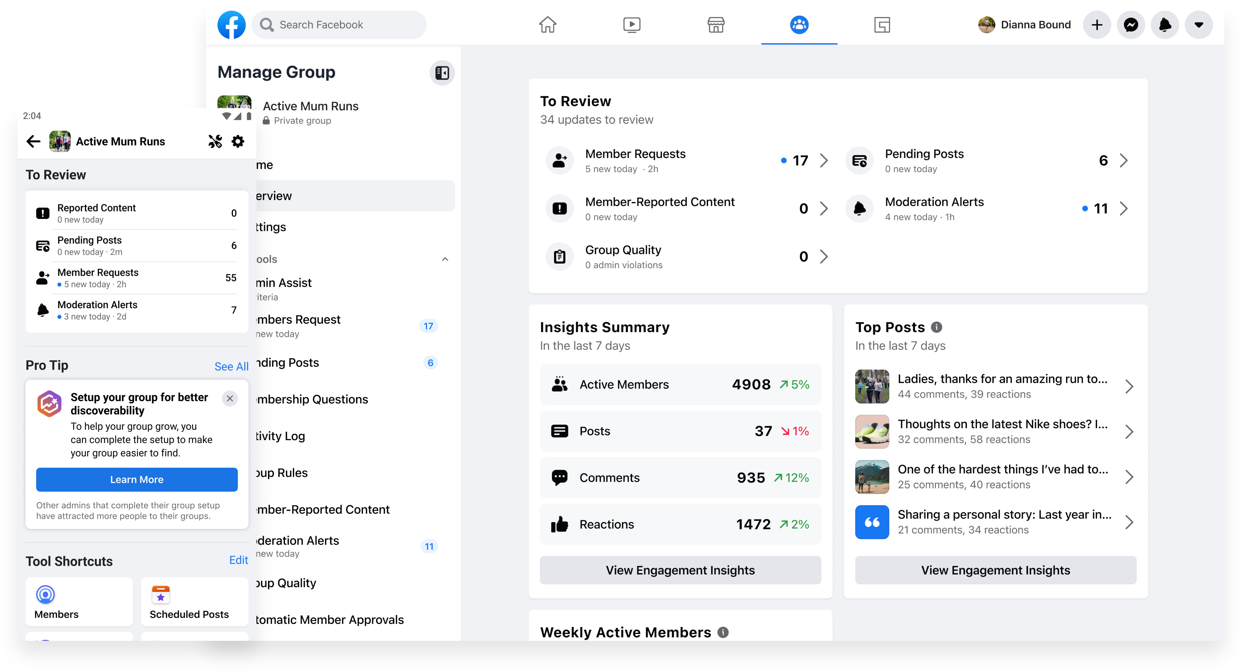
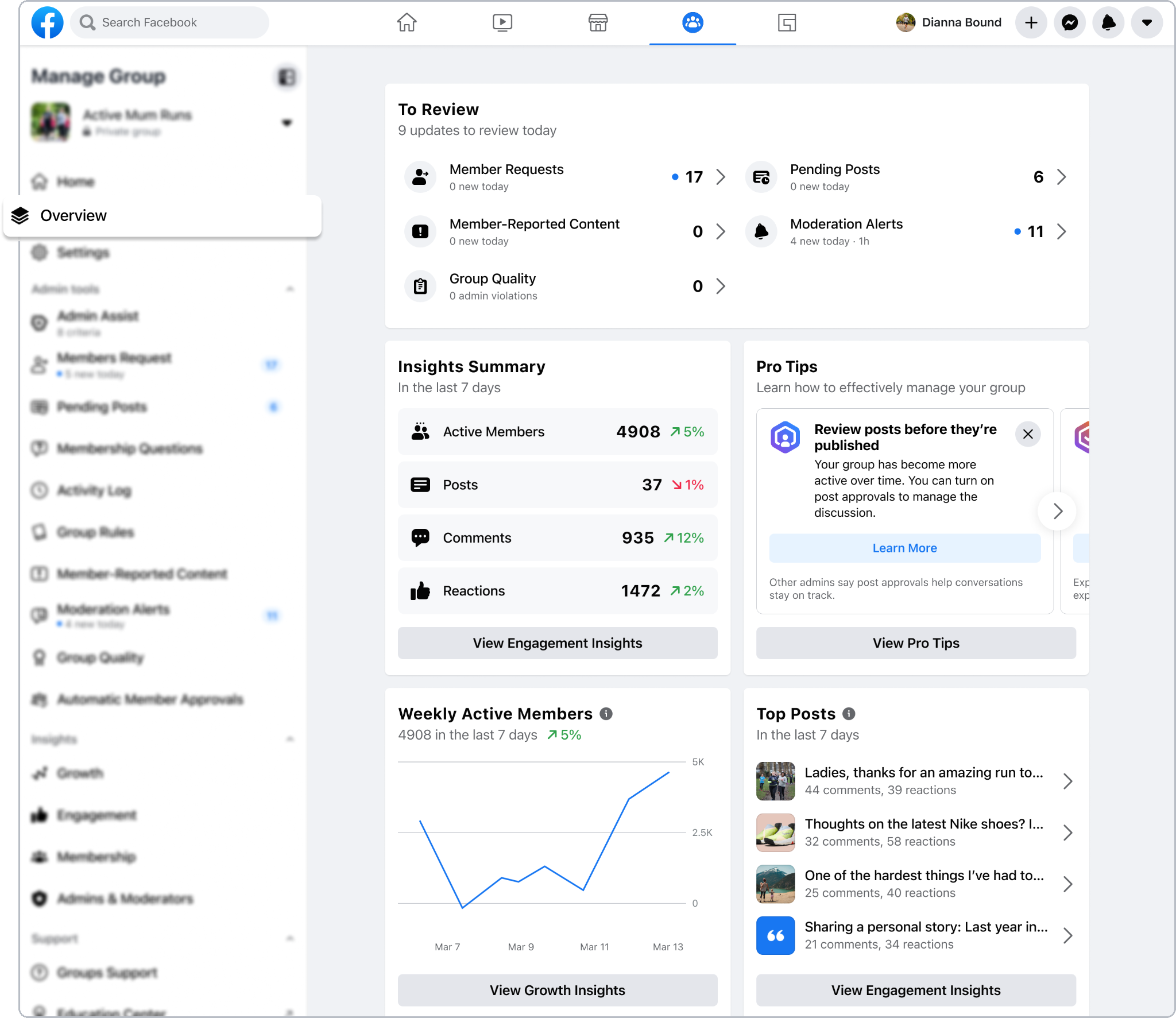
The new Overview surface gave admins a centralized home to understand what needed attention and how their group was doing. A “To Review” section brought together member requests, pending posts, reported content, moderation alerts, and group quality issues, with counts and direct entry points into each queue. Admins could scan their pending work before deciding where to act.
Alongside these tasks, an Insights Summary surfaced activity across members, posts, comments, and reactions, while Top Posts highlighted conversations generating engagement. Bringing these signals together connected day-to-day moderation with a broader view of community health. I organized the dashboard around these two needs—taking action and understanding the group—so admins could move between them without piecing together information from separate tools.
Settings
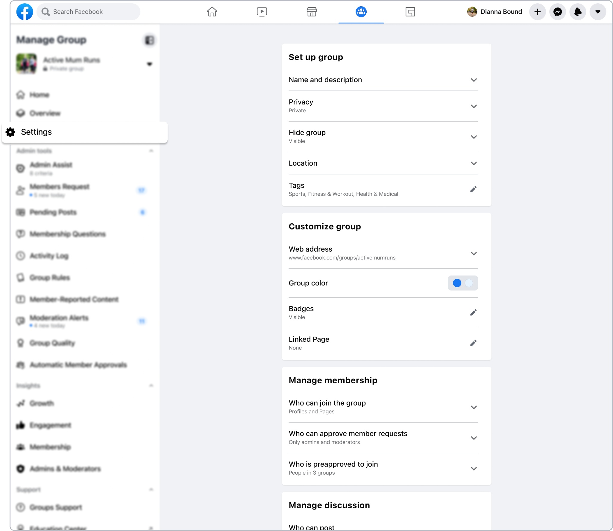
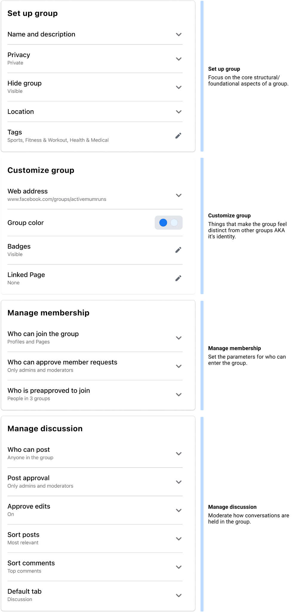
Over the years, Group Settings had not been updated in a long time, with new settings added in without any real consideration of the other settings. I worked with my content designer and UX researcher to organize them into clear categories, so admins could find what they needed and teams knew where to place new settings as the product grew.
Admin Tools Refresh
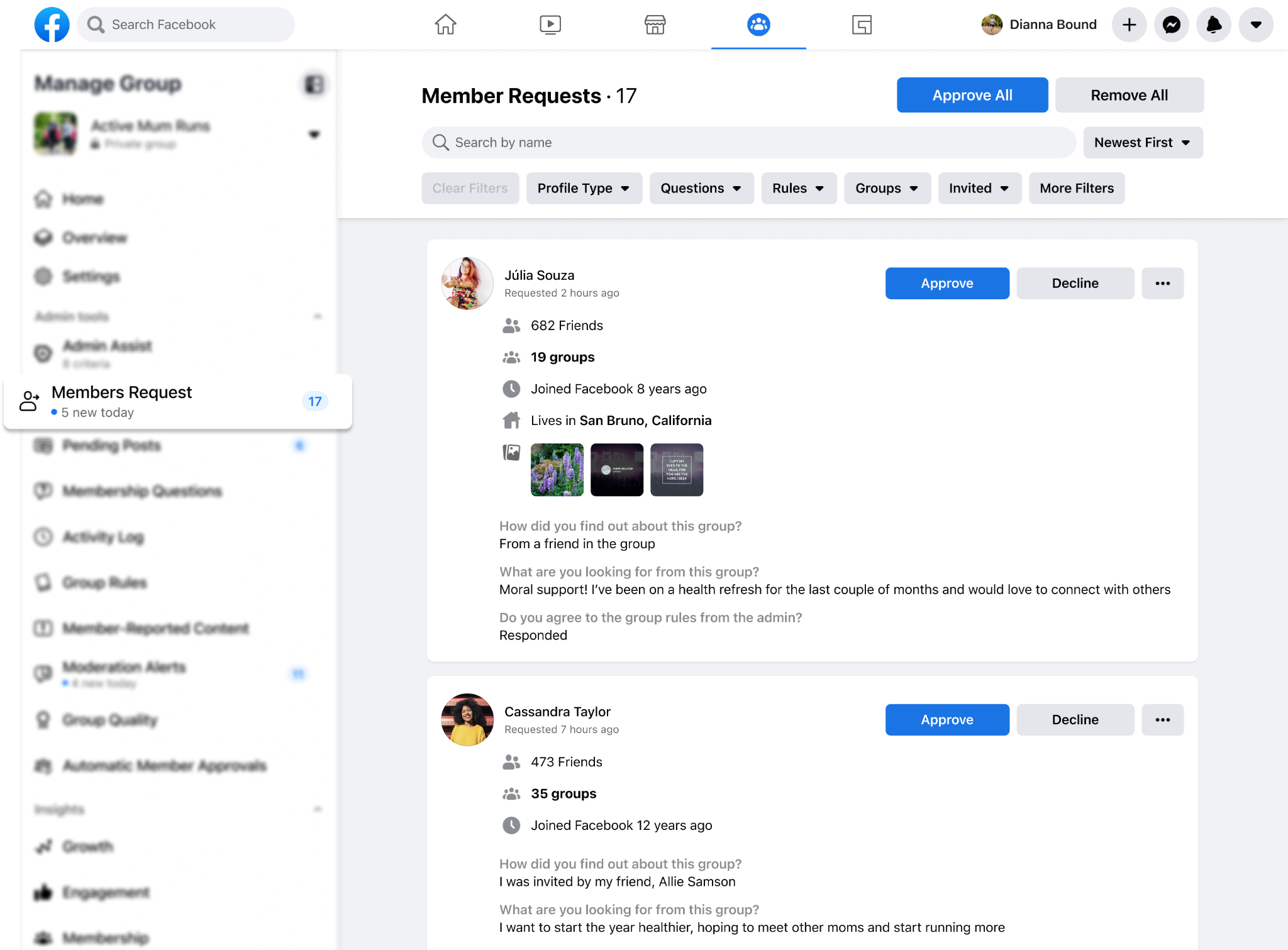
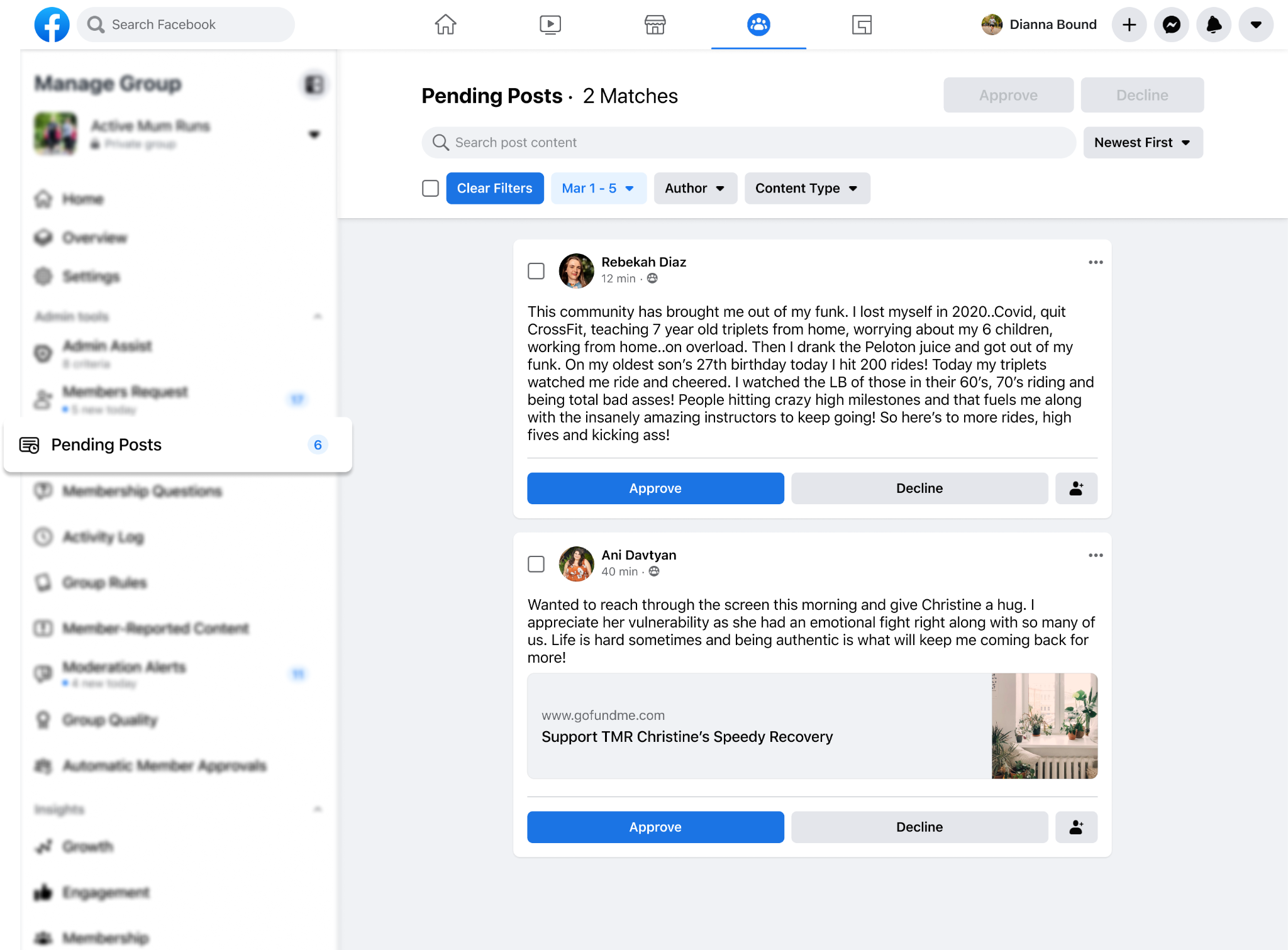
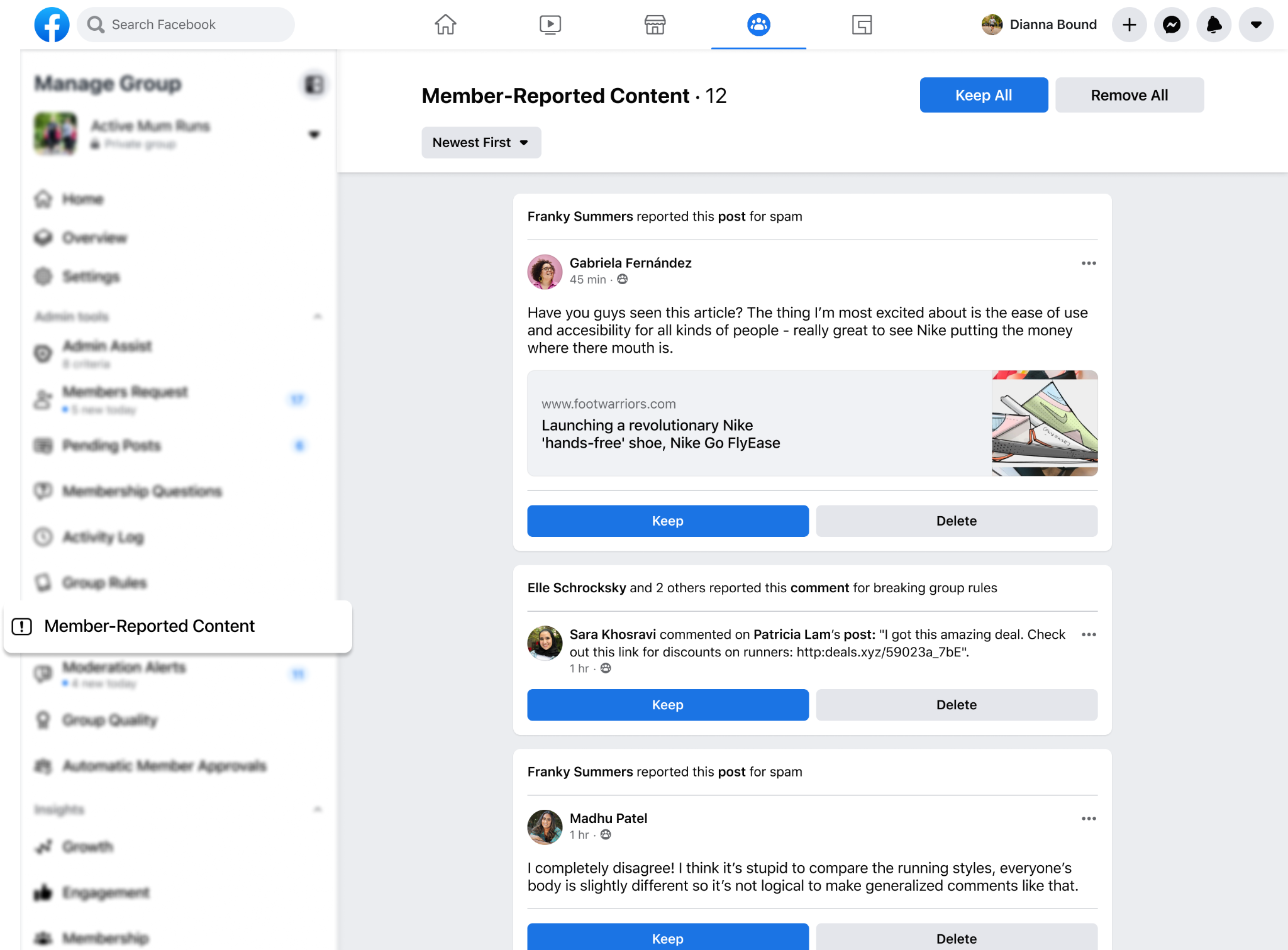
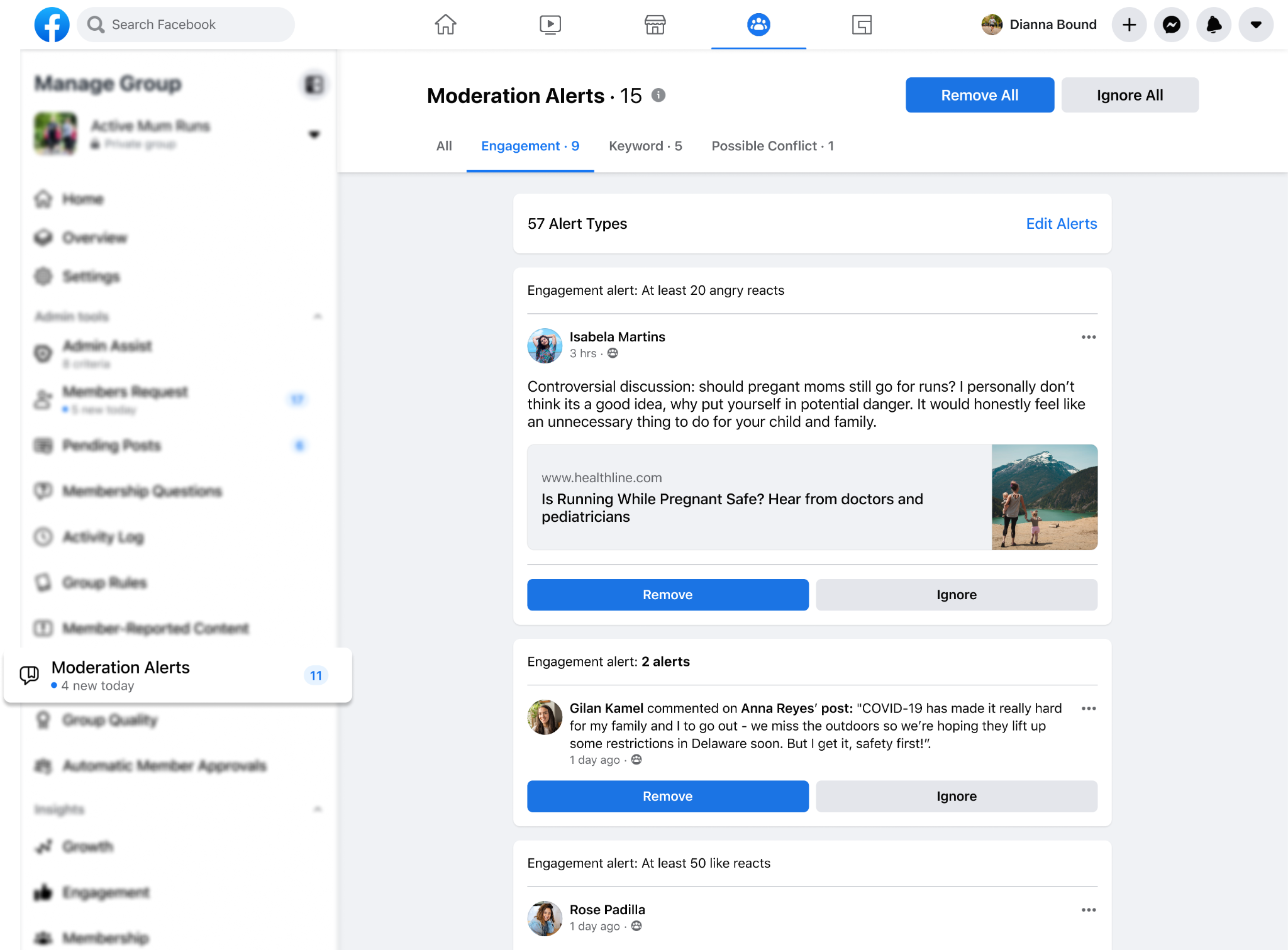
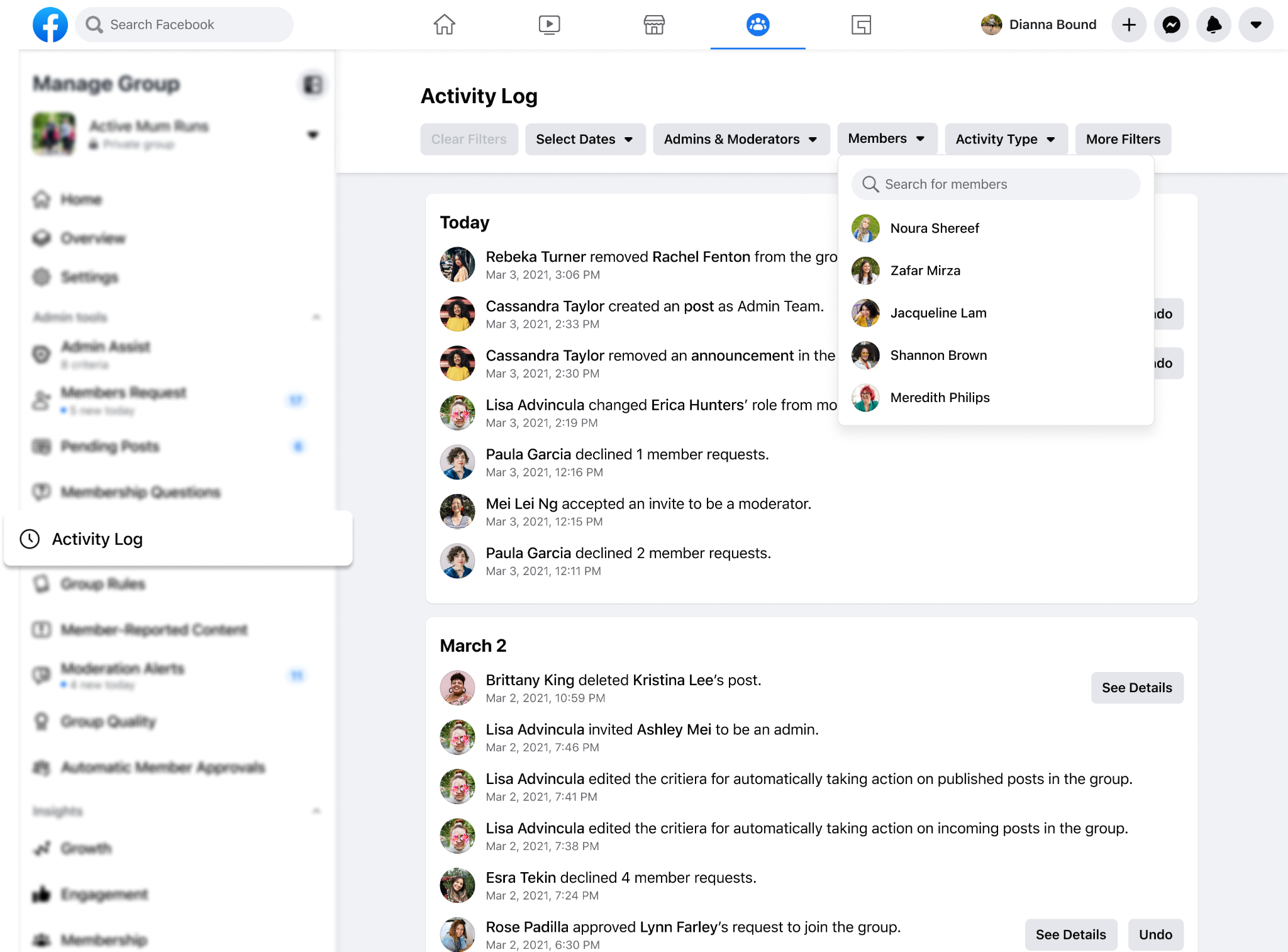
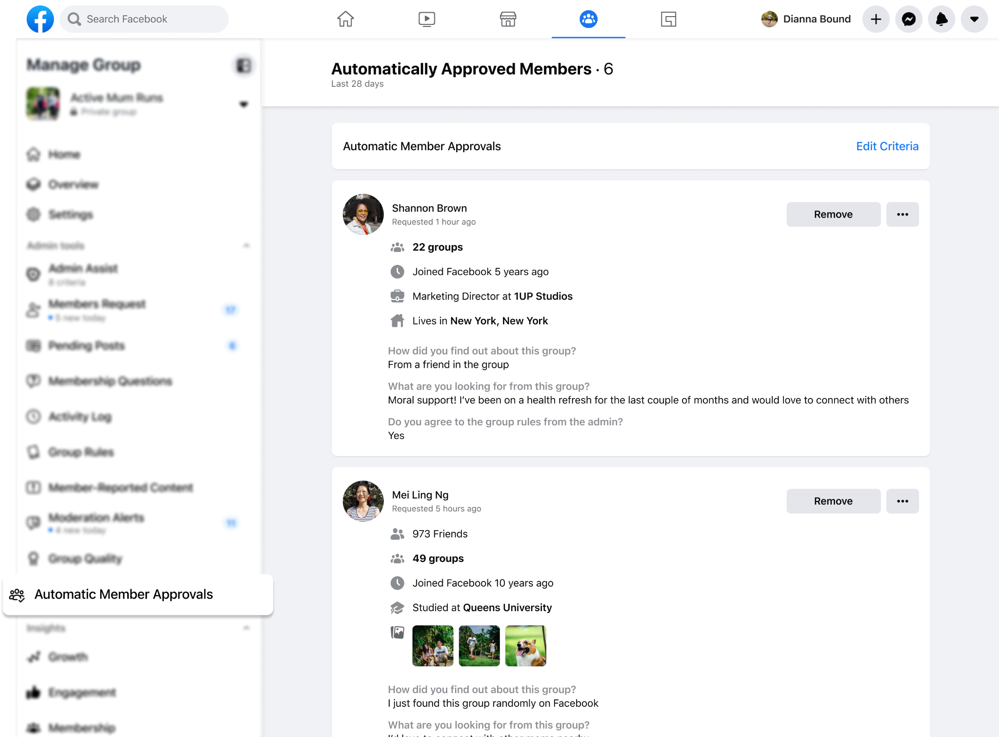
I redesigned over five admin queues and refreshed 10+ other admin tools, including their secondary surfaces. A shared layout gave teams a consistent foundation they could adapt to each tool’s needs, with room for filters, bulk actions, and dropdown menus.
Insights
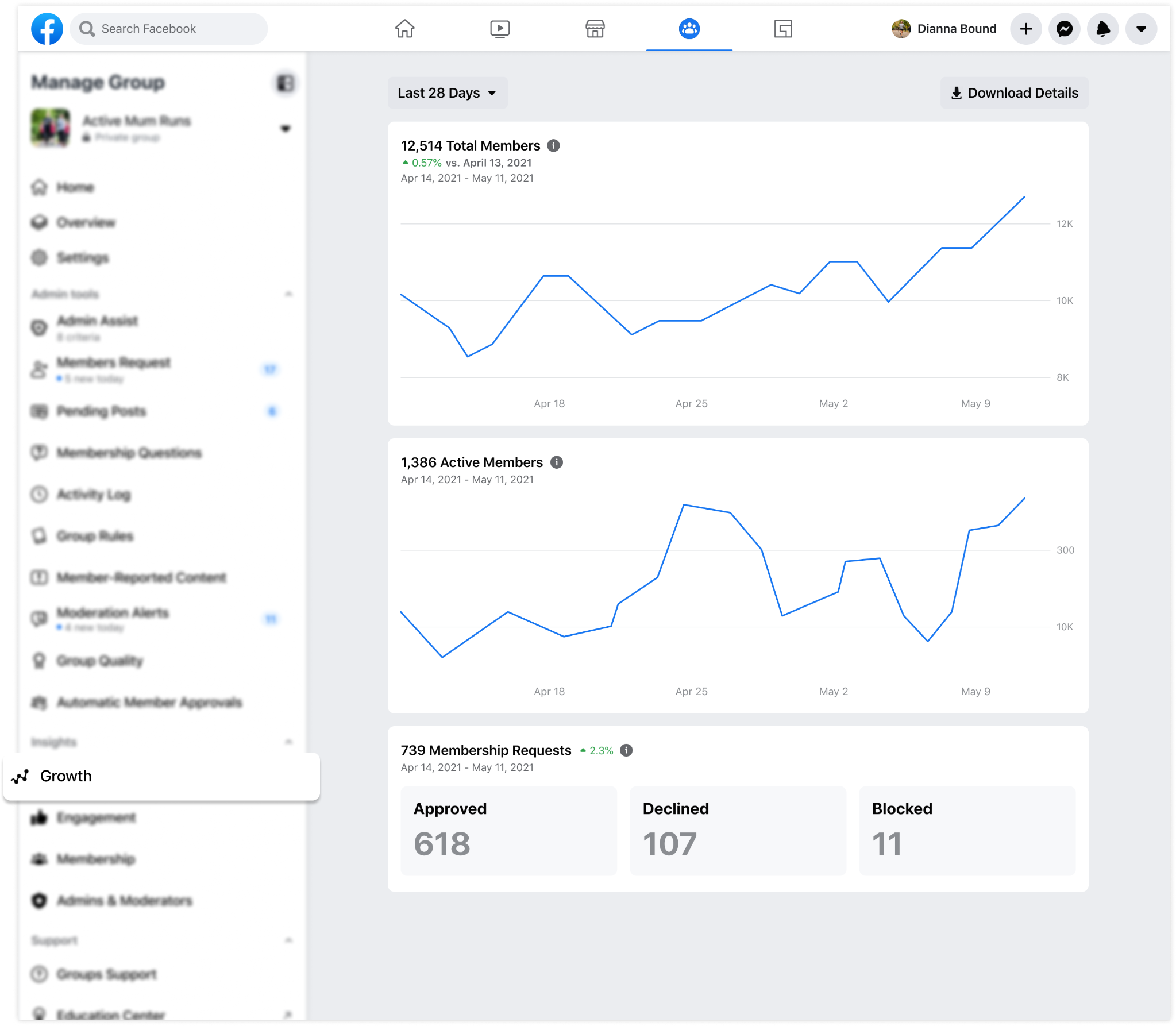
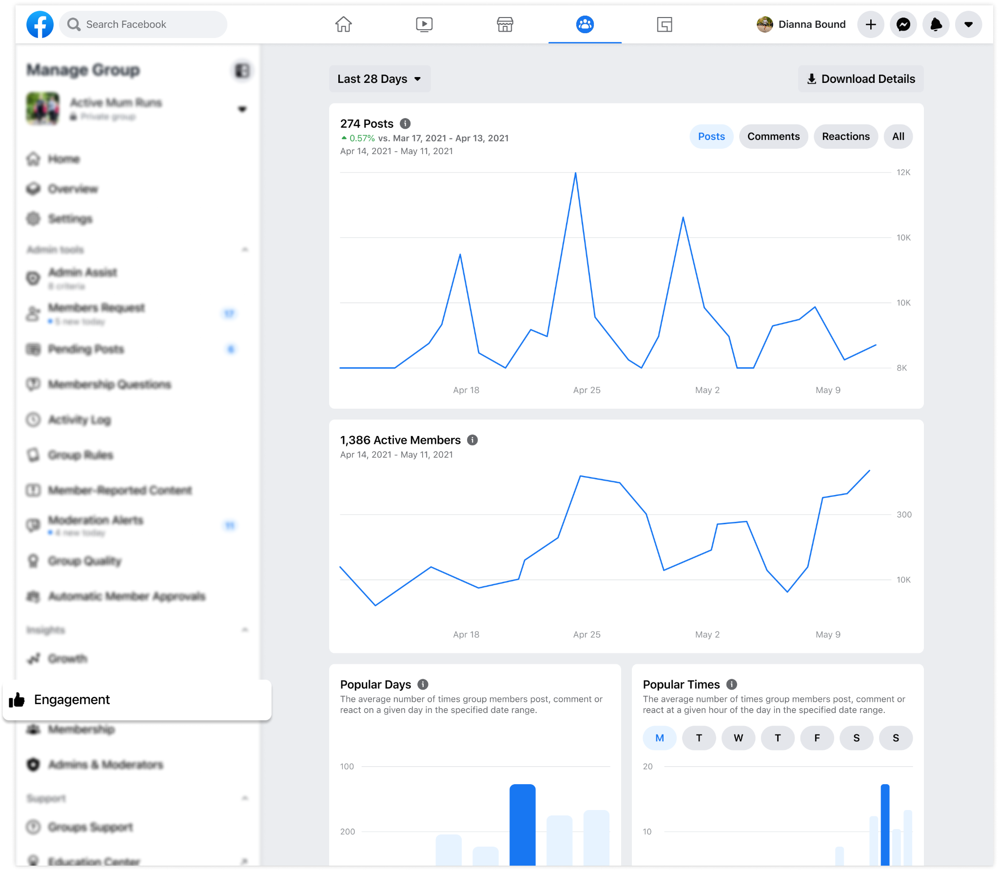
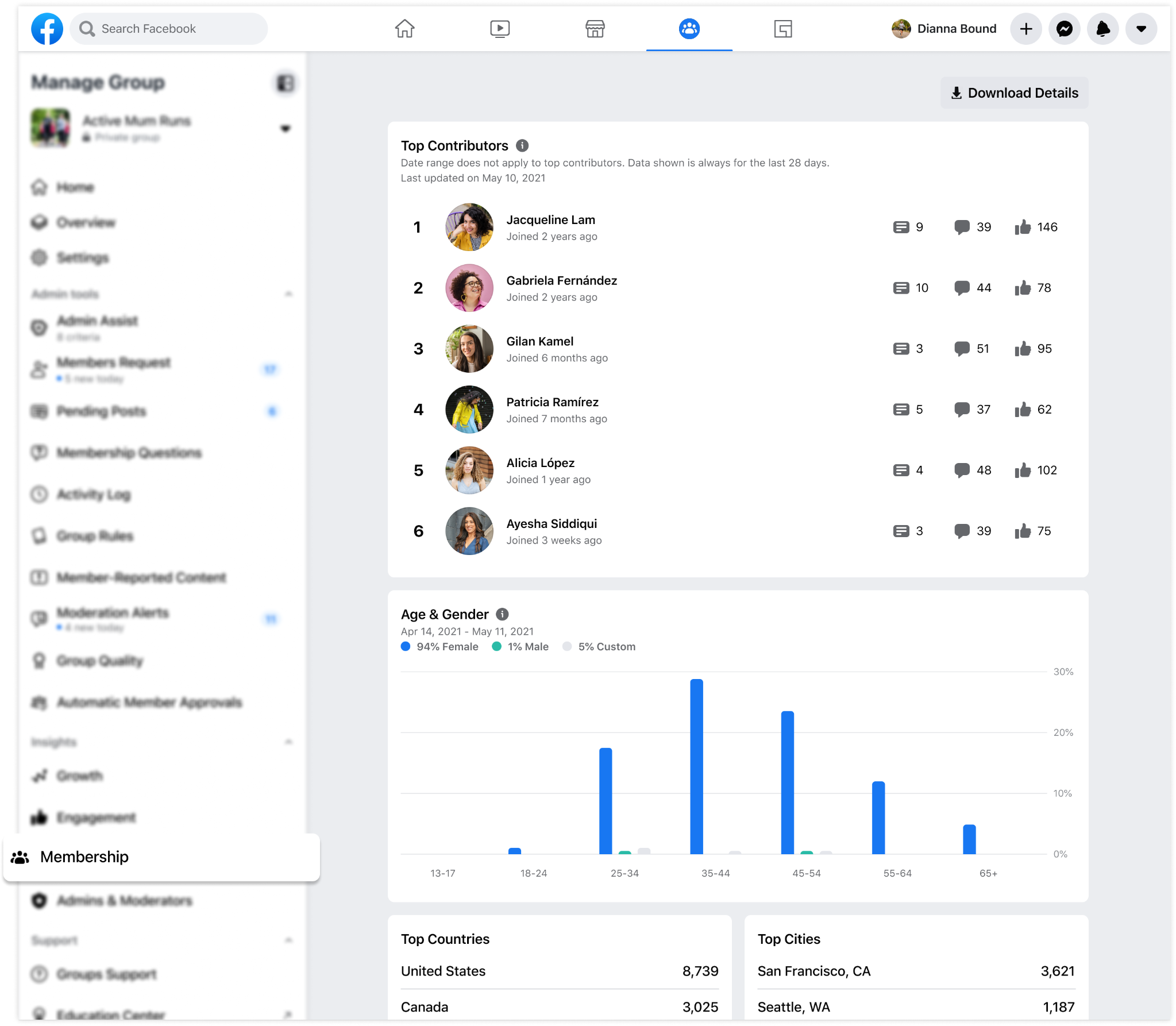
Insights brought growth, engagement, membership, and admin activity into the same management architecture. Showing metrics over a selected timescale gave admins a broader view of their group’s health: they could see how activity changed over time, distinguish a short-term spike from a sustained trend, and put a single number in context.
Specific breakdowns and distributions made these insights useful for day-to-day decisions. Popular days and times could help admins choose when to post, while language and location breakdowns could inform how they tailored content to their members. Seeing where participation was concentrated—or where it was falling behind—helped admins decide what to encourage next. The goal was to connect understanding the community with concrete actions admins could take to support it.
MORE ADMIN
TOOLS
In my previous role on the Groups Core & Platform team, I was a primary design POC for the Groups product council, reviewing 500+ requests from various teams, aligning on quality and integrity, and collaborating with them to build and integrate into our infrastructure.
As part of the Groups Admin team, I also worked across several admin tools and collaborated with teams to build new ones, here are a few that I directly worked on:
Chats in Groups
Enabling group admins to create Messenger chats, connected back to their Group, to support more real time conversation and engagement amongst members. Partnered closely with the Messenger team to create this seamless integration and experience.
Group Types
Partnered with UX research and data science to identify needs in Parenting and Buy & Sell groups. This evolved into a flexible ‘Features’ section in Group Settings, where admins could customize their groups and internal and external teams had a dedicated home for new features.
Group Voice Switcher
Designed a way for admins to toggle between their personal and Page profiles when interacting with their community. Admins could use an official, administrative Page voice for moderation and their personal voice for engagement.
Groups Tab
Built a new Facebook tab dedicated entirely to Groups: a starting point to discover groups through categories and suggestions based on activity, search for groups, and manage the groups people admin.
Admin Assist
Designed the very first concept for automated admin actions, laying the groundwork for what became the highest-adopted admin tool in the toolkit. Admin Assist was later surfaced prominently through the Admin Home architecture I built.
Group Badges
Helped design the badging framework for Groups: “role” badges (platform-defined labels like Admin and Moderator) and “expression” badges (member-generated, like New Parent or Superstar). This framework later informed my approach to WhatsApp Member Tags.
Welcome Post
Conceived the original “Welcome Pack” concept, which evolved into the Welcome Post system for new public groups.
Group Insights
Redesigned membership insights, top posts and the insights entrypoint based on top admin pain points, and added a share function so admins could communicate group performance to their mod teams.
Apps for Groups
Designed the first public version of third-party app integrations within Facebook Groups, extending the ecosystem to external developers.
Pre-Vetted Member Joins
Designed a flow for admins to upload pre-approved member lists, so known members bypass approval and join instantly.
Community Profile
Designed the admin tooling integration for Facebook’s new Community Profile entity (merging Groups and Pages). Built the IA for management tools, integrated 5+ existing tool systems into the new surface, and conducted a holistic UX audit to identify navigation and consistency issues.
REFLECTION
Longest-tenured designer on Groups
Working on Groups over several years gave me a broader view of how the product evolved: why decisions were made, where experiences overlapped, and how individual features connected. That context helped me look beyond a single team’s request and consider what would make the overall experience clearer for admins.
It was also rewarding to keep building for a product I deeply cared about—giving people the tools to turn their interests and passion into communities.
Scaling also means simplifying
As the toolset grew, I learned to question whether every new capability needed its own destination. Sometimes the better solution was to integrate it into an existing flow, consolidate overlapping tools, or remove something that no longer served a clear purpose.
Designing for growth meant continually revisiting the whole experience, so admins didn’t inherit the complexity of our internal team structure.
Architecture creates shared understanding
The architecture became a framework for collaboration as well as navigation. Clear categories and placement principles helped partner teams understand where their proposals belonged and gave us a shared basis for reviewing them.
I learned that a scalable system needs both a clear structure and people who can consistently apply, challenge, and evolve it.